My Contribution
User Research,Prototyping, UI Design
Summary
I helped empathise and restructure the information architecture of the National Library Board website over the course of two weeks.
The National Library Board (NLB) website offers access to an extensive range of reading and learning materials for people of all ages. The platform also provides information of regular programs and events for NLB’s patrons. However, the massive amount of information on their website is overwhelming and the current structure of the information architecture tends to disorient users while on their site.
This is a group project where I worked with two others.
Improve site navigation through restructuring of the information architecture.
Improve the experience of core functions.

Promote lifelong reading & learning.
Preserve and share Singapore's heritage.
Future-proof Singaporeans through digital literacy.
Cultivate knowledge sharing by forging strategic partnerships.
User interviews
Card sorting
Tree testing
Competitive analysis
Prototype testing
Persona
Affinity mapping
Adults with young children (≤12 years old)
Teens (13 - 19 years old)
Working adults (25 - 55 years old)
Seniors (≥60 years old)
Information-seekers need an organised way to browse and sift through the website so that they will not get intimidated by the sheer amount of information and exit the site.
Following the user interviews, we were able to create a user journey and personas. We then did a content audit of the existing website followed by an information architecture draft. Moving on, we performed a tree test before concluding with the final information architecture.
Landing Page
Added search bar and account button for easy access.
Focus on key information that the organisation wants to promote.
Introducing clear CTA button.
Brand colours consistency with cleaner layout.
Search Result Page
Added prominent availability status.
Simplified filtering options.
Introduced sort by top rated based on registered reviews.
Created distinct icons for easy distinguishing of content type.
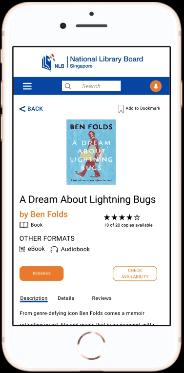
Book Details Page
Added prominent CTA button for reservation (key user goal).
Organized page information.
Fixed layout alignment.
Introduced registered reviews feature.
My Account Page
Added sort by due date.
List option for more book details.
Added warning status to highlight expiring book loans.
Added select all option for multiple renewal.
Added renewal eligibility status (green for eligible, gray for non-eligible).
Nationwide interactive map view showing all library locations.
Colored location pins displaying the respective book availability.
Number of copies available.
Show user's current location.
As there was a need to balance the user needs with the business needs, creating a clean layout is not as simple as it seems. We could not remove information that does not relate to the user goals without considering if the business want users to take notice of these information.